Sonos: Visual Identity Refresh
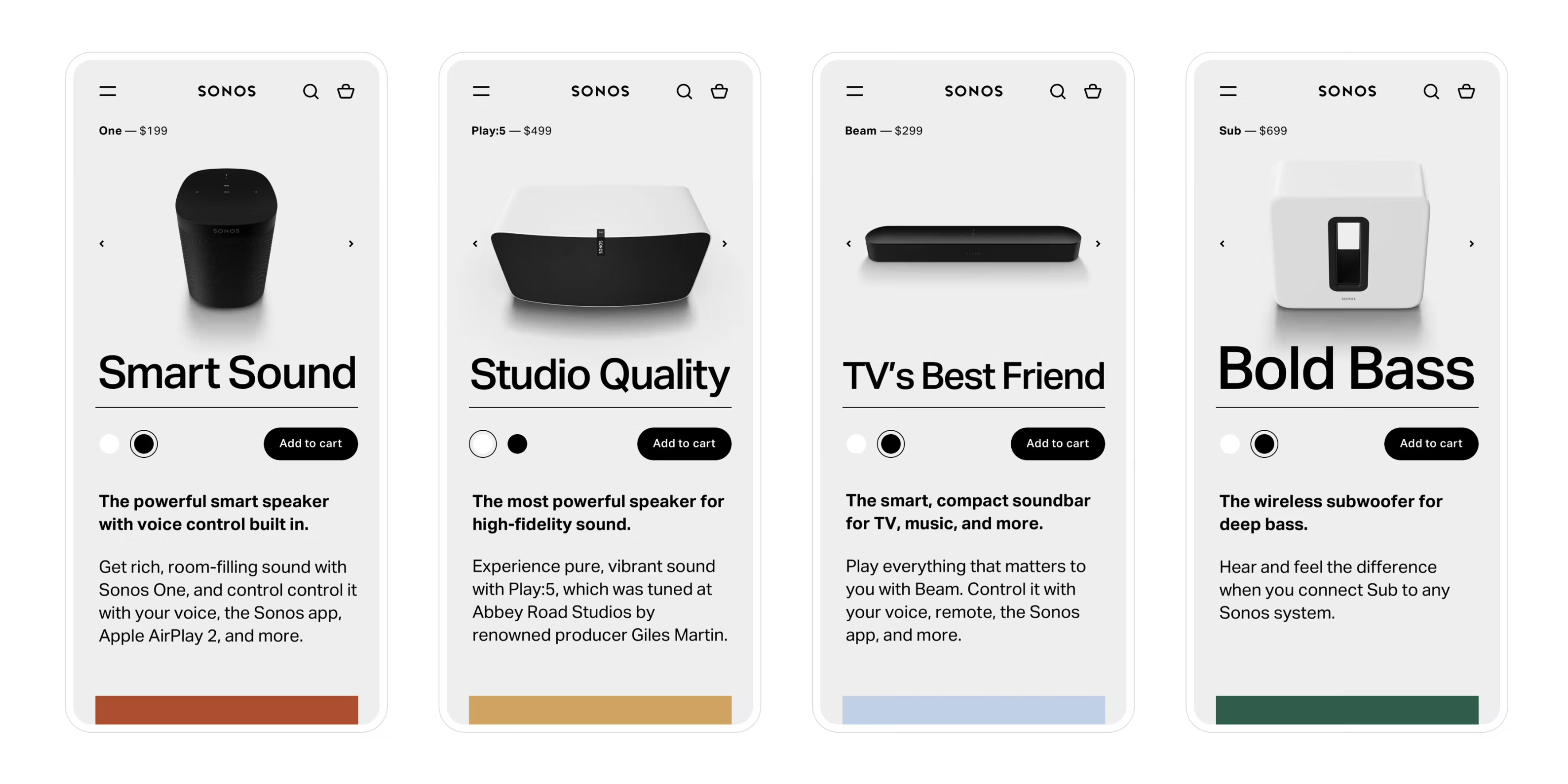
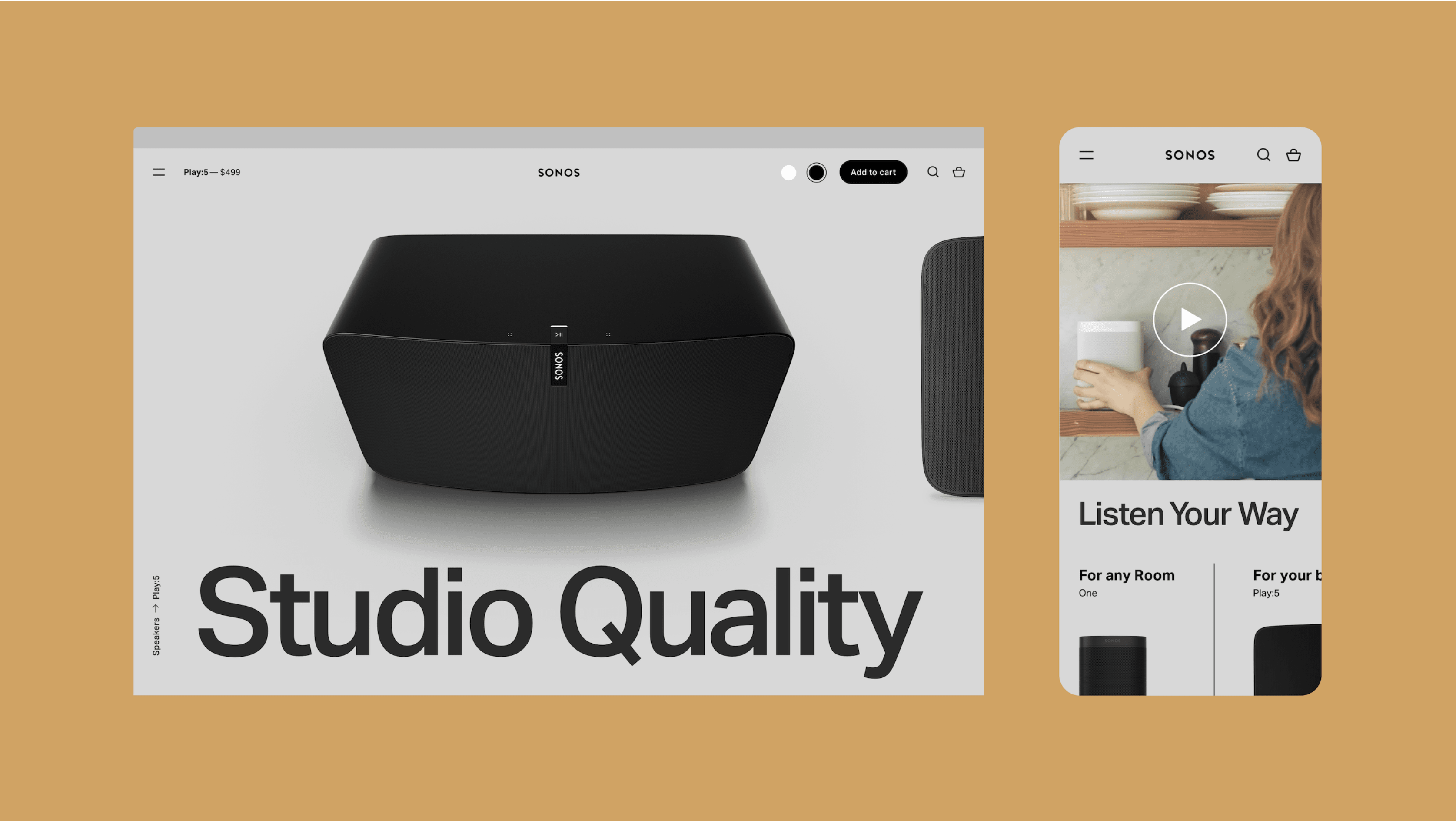
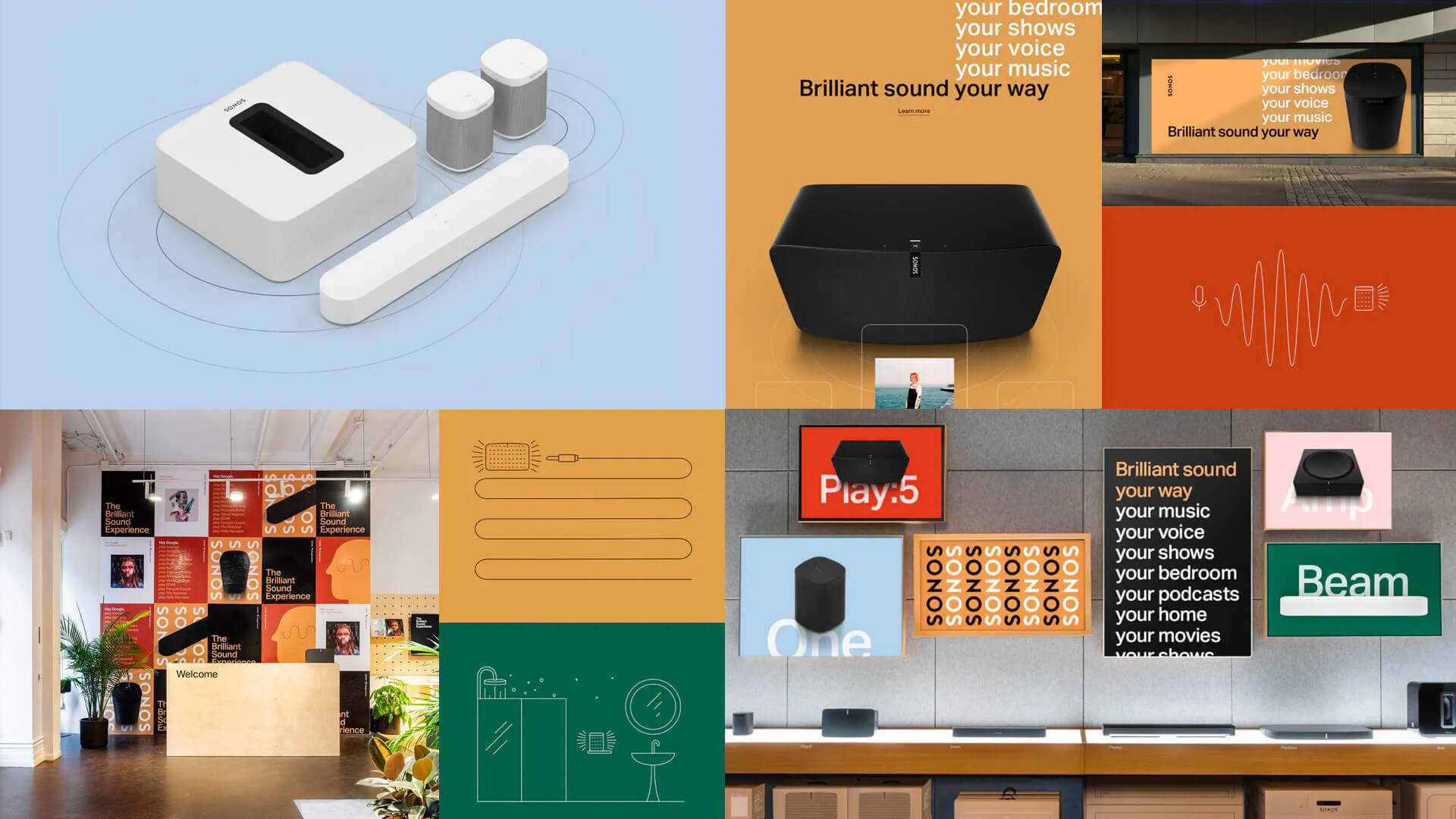
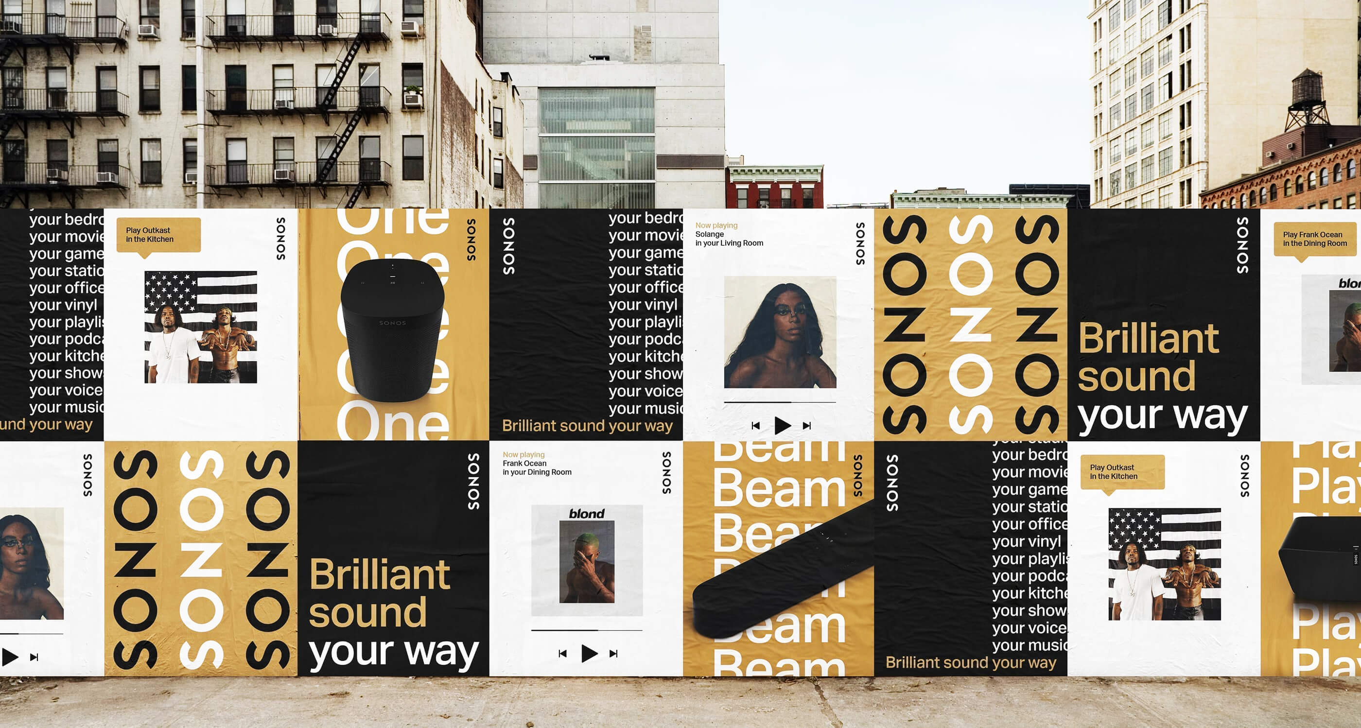
On May 1st, we introduced the world to the next wave of innovation in sound experience: Brilliant Sound Your Way. The new Sonos brand identity puts a fresh upgrade on the look and feel of the brand with a new approach to using color, illustration, typography, and some new design tools built for the future. Repositioning from 'The Home Sound System' to 'Listen Your Way', the new Sonos communications showcase the vast range of different ways to listen. We approached this rebrand with a rigorous design process, system thinking and centering everything around the listester and their needs. We wanted to highlight the beauty in the products, the magic of the software and show Sonos’ signature commitment to quality and design.
Rooted in Swiss design, the previous identity leveraged Helvetica as the brand typeface and we moved towards Aktiv Grotesk, a typeface which in many ways is a direct response to Helvetica, but optimized for the digital age. While Aktiv shows many similarities to Helvetica, we set it completely differently: expressive and melodic.
Role: Design & Creative Direction
Creative Team: Edward Yeung, Jane Cronk, Jessica Trombatore, Benoit Olive
Date: 2019
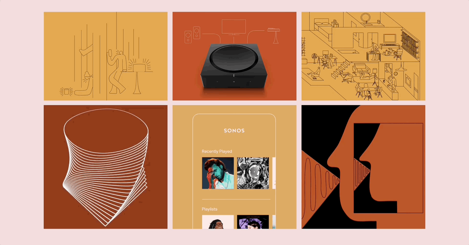
In our refresh, we added a seasonal palette that can change with time and season inspired by Sonos' roots and are rightfully named the Santa Barbara shades. Each color is chosen due to its ability to make Sonos' products shine. The first iteration of this seasonal palette—consisting of colors named Sky, Rose, Sand, Rust, and Pine—was inspired, quite naturally, by some of the local scenery outside the company’s Santa Barbara headquarters.
“We organically rejected the notion of permanent brand color,” says Michael Leon, Global Creative Director at Sonos. “It felt like a dated concept”. “Once we freed ourselves of that, we were able to open our minds to more timely influences. As soon as you etch something in stone, it instantly feels dated. The world just moves too fast.”


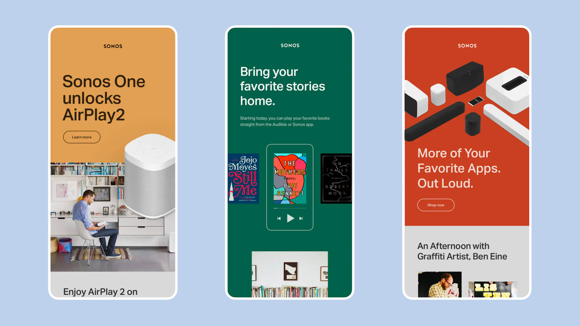
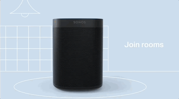
Illustration visualizes abstract concepts and simplifies complex ones. We use illustration to showcase the product experience, sound visualization, education, and environments. This style also works because it is easily replicated by the internal Sonos team and partners.
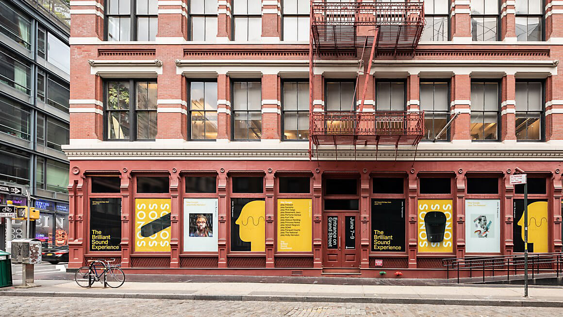
To roll out the new brand identity and voice, Sonos launched a global brand campaign with ads in Times Square, Rolling Stone magazine and other prominent placements around the world–as well a design refresh of key digital touch points like the brand’s global Instagram account, customer emails, and brand videos. After we had finalized the look and feel, Sonos took the opportunity to completely redesign their website with a digital agency, Instrument, using our assets.