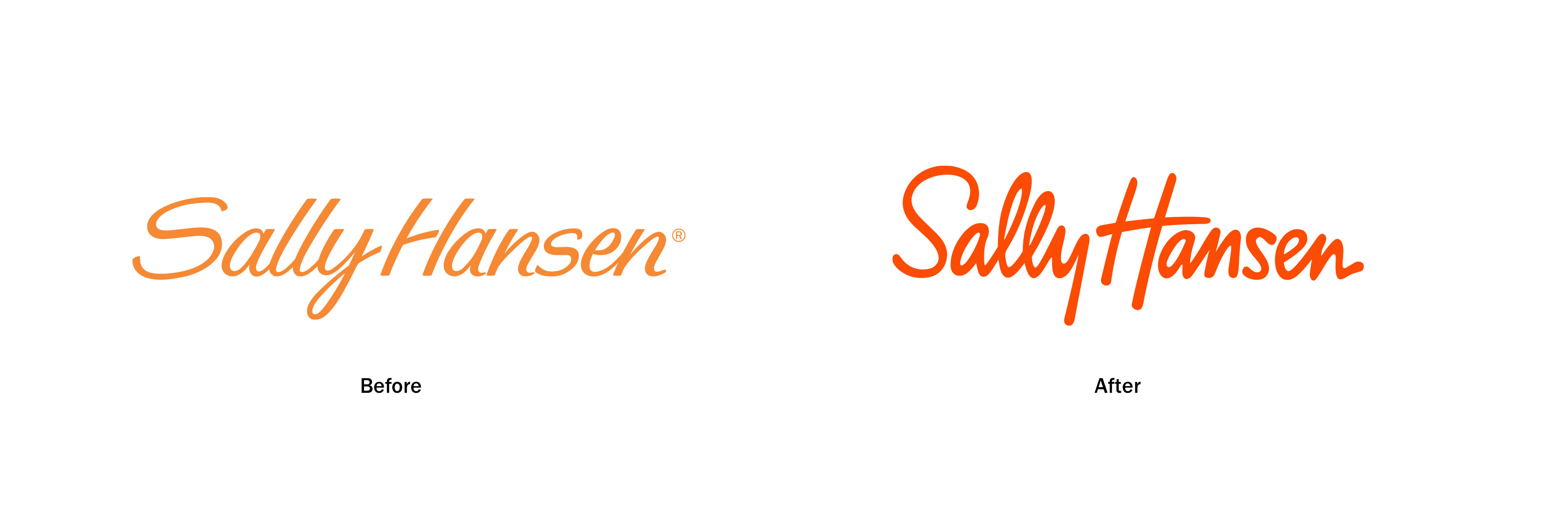
Sally Hansen’s new signature
Making a global nailcare sleeping giant fresh and relevant again. After 50+ years, Sally was at a juncture. We were asked to reinvigorate the Sally Hansen brand by evolving the key brand assets: logo and color. We took what was once ‘your mother’s brand’ to modernize it from head to toe. The handwritten elements of the Sally brand keep her unique relative to her competition and has a lot of equity but it felt dated. We needed to uphold it but also evolve it to be relevant and timeless without alientain all the moms out there. Orange is one of Sally Hansens’ most iconic assets as well. It’s eye-catching and recognizable, and exudes the positive, creativity and confidence that comes with that slalom feeling our products provide. We wanted to also elevate the brand above ‘just products’ and a new bold orange played a huge role in unifying the portfolio.
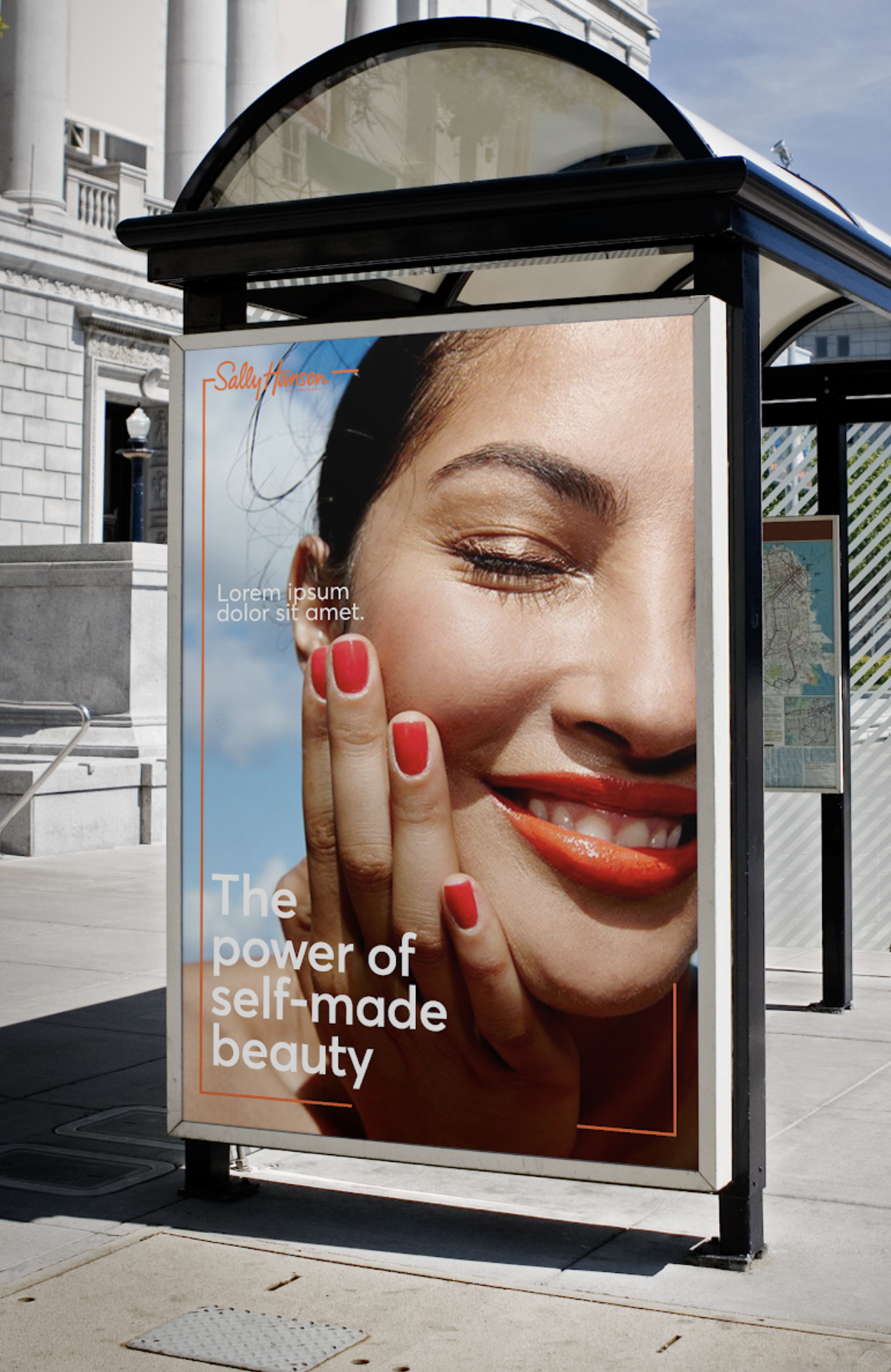
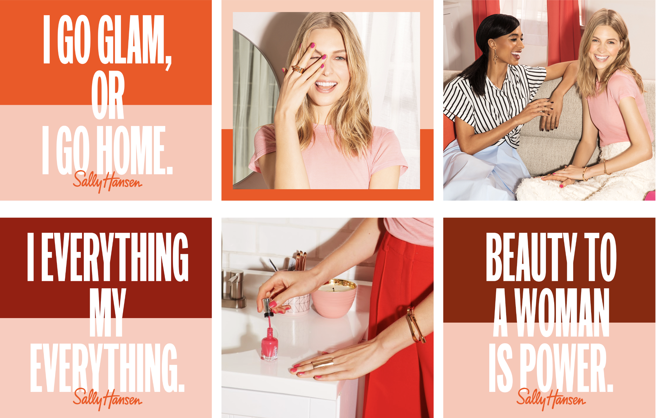
Then through 6 brand truths, we gave them a new brand position: The Power of Self-Made Beauty. This was reflected in the core visual identity and to launch various campaigns. This was a team effort of 12+ designers that pitched in at Anomaly.
Role: Senior Designer
Creative Leads: Andrew Guirguis, Cynthia Pratomo, Gillian Haro
Date: 2017